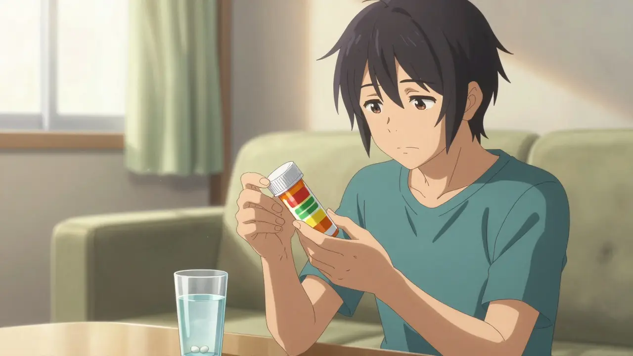
Have you ever picked up a new bottle of medicine, squinted at the tiny white stickers plastered over the main label, and felt a wave of confusion wash over you? You aren't alone. Those colorful bands-red, yellow, green-are doing a lot of heavy lifting for your safety, but they aren't always obvious about what they mean. These small adhesive strips are known as Pharmacy Auxiliary Labels, formally recognized as the secondary warnings applied to medication containers to convey supplemental information not included on primary prescription labels. While the main label tells you what you have and who prescribed it, these stickers tell you how to handle it safely. Understanding them can actually change the outcome of your treatment plan.
In the world of pharmacy safety, these tools are considered vital bridges between the pharmacist and the patient. Research indicates that roughly half of patients forget verbal instructions within two days of leaving the consultation room. That is a massive gap in communication. To plug this hole, the industry standardized on specific visual cues. For example, a red band usually screams "danger" or "critical," while green often whispers "do this daily." It sounds simple, but a 2019 study found that placement and color psychology play a huge role in whether you actually read and follow the instruction.
The Purpose Behind the Sticker
It is easy to think of these labels as just extra bureaucracy, something printed out after hours at a busy counter. In reality, they are evidence-based safety devices. The National Association of Boards of Pharmacy guidelines strongly recommend their use because they directly address a known statistic: approximately 1.3 million medication errors occur annually in the healthcare system. That is nearly 4,000 mistakes every single day. Many of these happen simply because the person taking the drug misunderstood how, when, or under what conditions to take it.
These labels evolved organically starting in the 1970s. There wasn't one single inventor; rather, pharmacy teams realized they needed a faster way to highlight risks than relying solely on a computer screen. Today, standards dictate that these labels typically measure about 1.5 inches wide by 3 inches long, designed specifically to fit standard amber vials without obscuring the doctor's name or the drug details underneath. They are made to survive moisture and handling, often printed on materials like Krome paper or synthetic alternatives that won't peel off if the bottle gets sweaty in a gym bag or humid in a bathroom cabinet.
Decoding the Color Codes
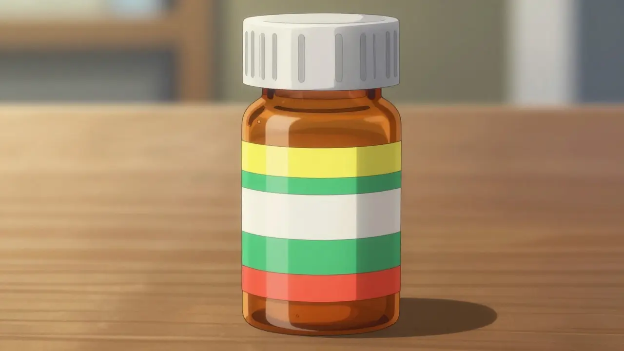
If you walk down the aisle of any community pharmacy, you will notice a pattern in the colors. This isn't random decoration; it follows implicit conventions designed to guide your eye to the most urgent information first. A University of Florida College of Pharmacy study tracked usage across thousands of bottles and found distinct preferences for specific colors based on urgency.
| Color | Typical Meaning | Common Usage |
|---|---|---|
| Red LabelIndicates critical safety warnings requiring immediate attention. | Critical Warning | Used for habit-forming drugs or alcohol interactions (approx. 37% of warnings). |
| Yellow LabelHighlights cautionary information regarding side effects or driving. | Caution / Side Effects | Made for drowsiness, sun sensitivity, or kidney issues (approx. 28% usage). |
| Green LabelSignals general usage instructions or administration methods. | General Instructions | Take with food, shake well, finish course (approx. 22% usage). |
| Blue LabelDenotes storage requirements or handling specifications. | Storage Requirements | Refrigerate, protect from light, or store below 25 degrees Celsius. |
Notice how the red label accounts for the highest percentage of warnings regarding serious interactions. When you see red, pause. Read it twice. It is likely flagging a risk like "May Be Habit-Forming" or "Do Not Drive." Yellow is softer but still warns of functional impairment. Green is often the friendliest-it's telling you the mechanics of taking the pill, such as swallowing it whole or avoiding dairy products. Interestingly, 87% of patients associate red with danger almost instinctively, which is why the design works so effectively without needing a manual.
Placement Matters More Than You Think
You might assume the label's position on the bottle doesn't matter much as long as it's there. However, a 2020 analysis published in the Journal of the American Pharmacists Association suggests otherwise. Where a pharmacist puts that strip affects whether you actually notice it. The standard practice in many pharmacies places labels vertically, running from top to bottom. This method preserves space but can easily hide behind the cap or get lost in the curve of the bottle.
Some forward-thinking clinics use interactive placement. Imagine a scenario where the label is placed horizontally around the middle, forcing you to rotate the bottle to read all the text. Studies show this increases noticeability by 63%. The goal is to create a moment of engagement. If you have to physically turn the bottle, you are paying attention to the object in your hands. Unfortunately, due to printing limitations and time pressure, vertical placement remains common on about 82% of prescriptions. If you find yourself struggling to read a bottle, don't hesitate to ask the pharmacist to re-place it where it makes sense to you, or scan the bottle until you spot the relevant color code.
Beyond Text: Icons and Pictograms
Words fail us sometimes, especially when stress or poor eyesight comes into play. This is where pictorial representations become powerful allies. An Annals of Pharmacotherapy study from 2018 quantified this benefit, showing a 47% higher comprehension rate among low-literacy patients when instructions included simple icons alongside text. Imagine a picture of a fork and knife next to "Take with Food," or a snowflake icon next to "Keep Refrigerated." Pictograms in Pharmacy provide a universal language that transcends translation barriers and reading levels. While adoption has been slow in some regions, leading pharmacy chains are moving toward integrating these visuals to improve safety. It turns a boring administrative requirement into a helpful visual cue. Some even link to video instructions via QR codes now, bridging the physical and digital worlds to ensure the patient knows exactly how to administer complex medications like inhalers or injections.
The Problem of Clutter
Despite their benefits, too many stickers can be counterproductive. We call this "label fatigue." If a bottle looks like a traffic cone covered in tape, patients tend to ignore the noise. Data shows that 31% of prescriptions suffer from label clutter. The optimal practice recommended by safety institutes is to limit auxiliary labels to 1-3 per container. Quality over quantity is the rule here. If a message contradicts another-for instance, saying "Take with Food" and "Take on Empty Stomach" simultaneously-it causes confusion that leads to errors.
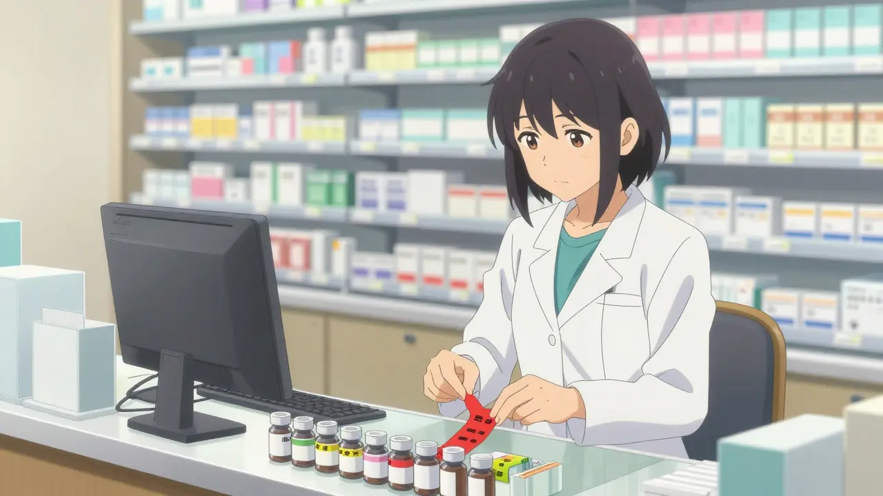
This highlights the importance of the pharmacist's judgment. A good pharmacist selects the labels that apply specifically to your medical history and current lifestyle, filtering out generic warnings that don't apply. For example, a label saying "May Cause Drowsiness" is useless for someone already retired at home, but critical for a commercial driver. Personalized application ensures the signal cuts through the noise.
How You Can Use Labels for Adherence
Your goal with these labels is adherence-taking the medicine correctly. Adherence impacts your health outcomes significantly. Research indicates that prescriptions with proper auxiliary labels have roughly 18.7% higher adherence rates for chronic conditions compared to those without. Over a year, better adherence saves a household significant money in healthcare costs, estimated around $1,200 per patient annually in prevented complications. To leverage this:
- Check the Color: Always scan for red or yellow first before storing the bottle.
- Verify Instructions: Compare the sticker against what was verbally explained to you.
- Ask About Ambiguity: If "Take with Food" appears, clarify if that means breakfast immediately or anytime near a meal.
- Respect Storage Cues: If you see a blue label, check your fridge space immediately. Heat destroys certain biologics quickly.
These small steps turn a passive receipt of medicine into an active management strategy. Even small changes like ensuring a refrigerated biologic stays cold during travel can prevent the medication from becoming ineffective before you even use it.
Frequently Asked Questions
What exactly is an auxiliary label?
An auxiliary label is an additional adhesive sticker applied to a medication bottle by a pharmacist. It contains supplemental safety information or instructions (like "Take with Food") that are not printed on the main government-mandated label.
Why do pharmacy labels use different colors?
Colors are used for psychological signaling. Red usually indicates critical warnings (dangers), yellow signals caution (side effects), green represents general instructions, and blue often denotes storage requirements. This helps patients identify priority information instantly.
Do these stickers replace the doctor's advice?
No, they supplement it. They act as a memory aid because studies show half of patients forget verbal instructions within 48 hours. They should be cross-referenced with the verbal counseling you received.
Can I remove the stickers from my bottle?
It is generally advised against removing them. While they can look messy, they contain critical safety data that protects you from dangerous interactions. If you prefer fewer stickers, ask the pharmacist if specific ones apply to your situation.
Are these labels required by law in the UK?
While UK regulations differ slightly from US laws, the Royal Pharmaceutical Society mandates clear patient guidance. Most auxiliary labeling practices align with global safety standards set by organizations like ISMP, even if specific colors are industry custom rather than legal statute.
Comments
Helping parents understand these codes protects children everywhere.
We need to make sure every family knows what the colors mean for safety.
I love seeing the emojis on the new labels! 💊👀 Makes it easier for me to understand!
Visuals work best for everyone.
Its hard to read somethimes when the pharmasy is busy.
They put them on fast but misspell things too.
Red means stop! Yellow means go slow! Green is okay!
Please read them!!! Safety is paramount!!!
The stickers are just confusing noise.
Corporate laziness drives these simplifications while risking lives with generic warnings.
They ignore nuance for mass production speed.
Glad someone is using :) pictograms now.
It helps people who struggle with reading small text.
Only true professionals know that text is superior to childish drawings.
Artistic simplification dilutes medical authority.
These changes really help people get better faster!
Agree we need clearer signs for everyone
Just keep it simple and useful
The evolution of pharmacy labeling represents a significant milestone in patient safety protocols.
One cannot underestimate the impact of visual cues on medication adherence rates.
Studies consistently show that red indicators trigger immediate attention mechanisms.
Green bands serve a different purpose regarding general administration instructions.
Yellow warnings effectively communicate caution regarding side effects such as drowsiness.
Blue labels are essential for denoting specific storage requirements and conditions.
Placement strategies influence whether a patient notices the information at all.
Vertical orientation often hides text behind bottle caps during casual inspection.
Horizontal wrapping forces physical interaction with the container for reading.
Research indicates engagement increases when rotation is required to view all text.
Clutter creates cognitive fatigue that negates the benefit of individual labels.
Quality control must limit the number of stickers to prevent information overload.
Pictograms offer a universal language that transcends literacy barriers entirely.
Icons like snowflakes for refrigeration are immediately understood across demographics.
Continuous refinement of these systems ensures better health outcomes for society.